Fonts can make it difficult for the reader to read. One place you can find new fonts is in PDF files. This could be a brochure, advertisement, promotional material, case study or anything that can be opened on a computer.
But how to find fonts in PDF files in Windows 10 when you see and like them? There are several ways to get around this situation.
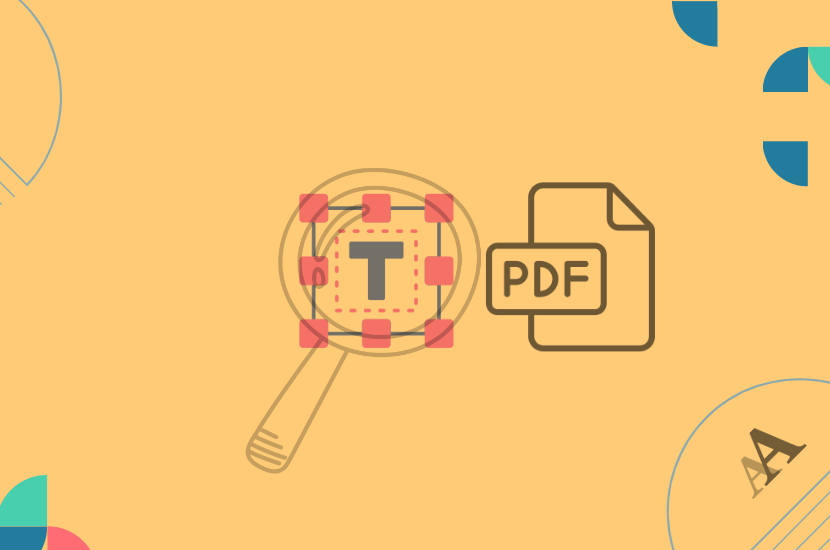
Identify the font with an online solution
You can find the font in a PDF file with an online tool. The most popular one for finding fonts is WhatTheFont. The tool works via a browser.
Just scan the text with your camera or upload an image of the project that contains the font.
After a while you will receive its name or other very similar fonts.
A few tips before you upload your file
The success of finding what font it is often depends on the preparation of the file we send for examination. Grab some helpful tips below:
- If the content is crooked, straighten the text, e.g. using Photoshop.
- When using the mobile application, you may have problems with the striping effect on the monitor.
- Always take photos at right angles.
- If the photo was taken from an extreme angle, change its perspective.
SwifDoo PDF
Alternatively, you can also find the font used with a PDF editor program.
SwifDoo PDF for Windows is a professional program when it comes to handling PDF files. Maybe this and much more, as you probably already know. You can open the PDF file with this program and choose Edit > Edit All, then select the texts and the font name will display in the popup.
Choose the right fonts for your projects
Fonts have the incredible power to convey a mood, create an atmosphere and decide whether your design exudes professionalism or leaves an impression of chaos and lack of coherence.
Here’s how to choose fonts that will help you achieve a specific brand vibe:
- Know the project’s personality – Before choosing fonts, it’s important to thoroughly understand your project’s personality.
- Consistency is king – Consistency in the use of fonts is the golden rule in design.
- Typography hierarchy – An important aspect of choosing fonts is establishing a typography hierarchy. In practice, this means assigning different fonts and sizes to different text elements to create a visual hierarchy.
- Don’t overdo it – Sometimes less is more.
Font guidelines for multilingual documents
Fonts play an important role in document format. They ensure the readability of information not only in source files, but also in multilingual documents. Some tips and best practices help typesetting professionals choose the right font for international content and marketing materials.
In the case of some languages, the sign and writing system is different than in the general languages. As a result, in order to process the text correctly, you need to choose a different font, and in some situations even special software or operating system.
Tips: Choosing a font for a multilingual document is extremely important. The selected font creates the atmosphere of the entire project and/or marketing materials. So, when starting the process of formatting a translated document, you should choose the font very carefully.
- You should use simple fonts that can handle all the characters of the possible target languages.
- Use a proper font size.
- It is advisable to use appropriate line spacing.
- Use well compatible fonts that work on more multiple operating system.
- You should avoid too compressed fonts.
- You should also avoid protecting text layers and outlines for fonts before sending text for translation.
In closing
The font has a significant impact on the readability and overall appearance of your PDF files and websites. Choose fonts that are easy to read and match the nature of your content. There are many solutions offer a wide selection of fonts, from classic to modern, that you can combine however you like. Remember to stay consistent – use a limited number of different fonts to avoid the appearance of chaos.
Choosing the right font is as important as choosing photos, company colors or the method of communicating with the customer. Your materials should be consistent and reflect the nature of your projects. We hope that after today’s article everything became clear.